
Background
This project was an assessment task for my Graphics 2 course at UNSW which I took in early 2022. Our brief was to create a design guide for an imaginary AGDA exhibition. We were to choose a concept that took the form of “Design is […]”. We were given a little over a month to complete this task, with weekly feedback and critique, directly with our class tutor, and as small groups. As part of the assignment, we were also told to select a previous AGDA award winner to feature in a double page spread of the exhibition booklet.
Concept Statement
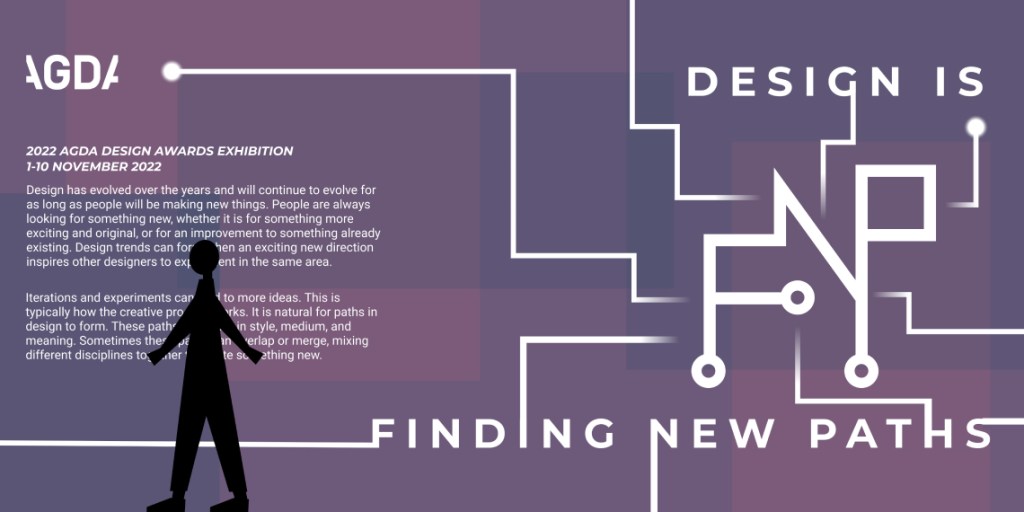
Design has evolved over the years and will continue to evolve for as long as people will be making new things. People are always looking for something new, whether it is for something more exciting and original, or for an improvement to something already existing. Design trends can form when an exciting new direction inspires other designers to experiment in the same area. Iterations and experiments can lead to more ideas. This is typically how the creative process works. It is natural for paths in design to form. These paths can differ in style, medium, and meaning. Sometimes these paths can overlap or merge, mixing different disciplines together to create something new.
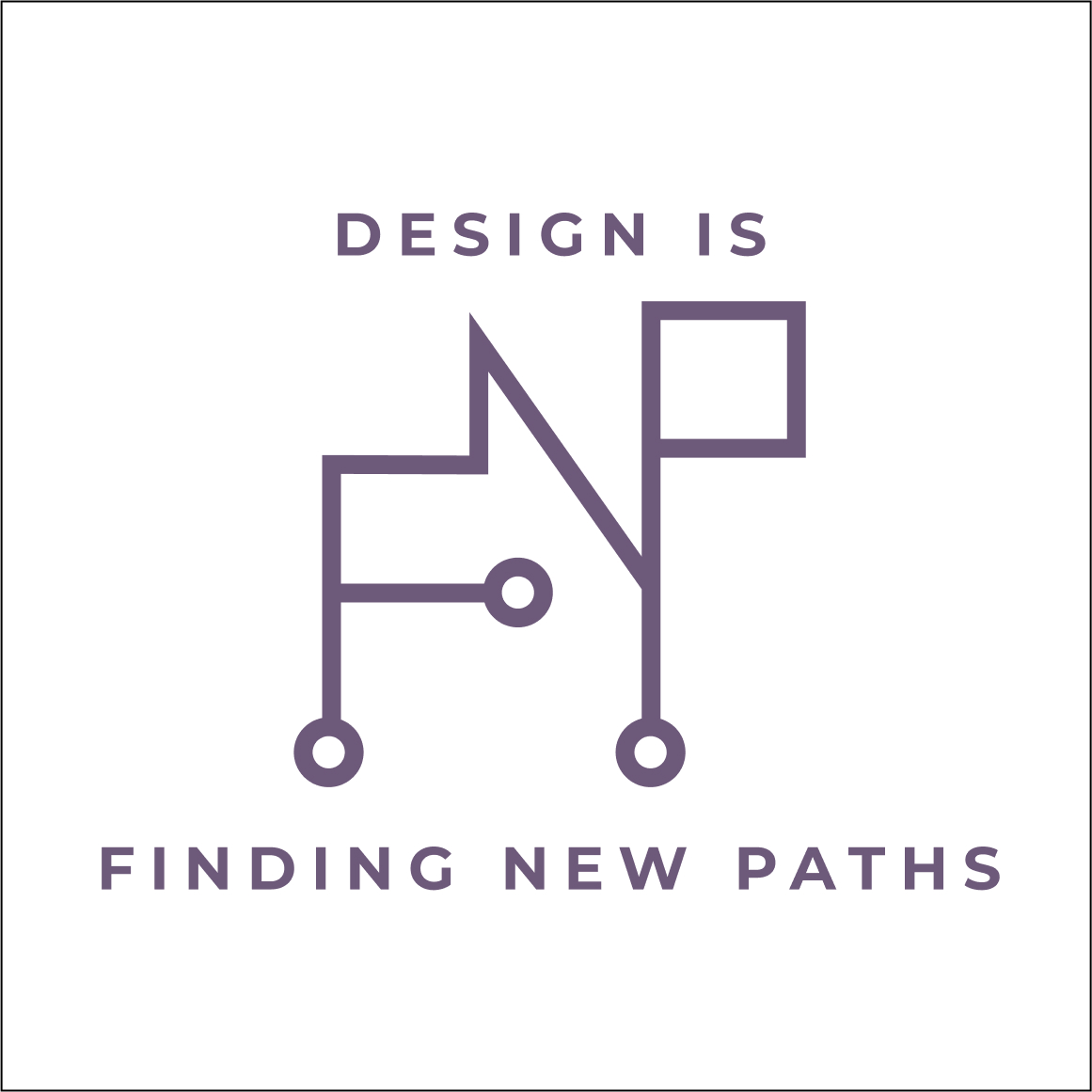
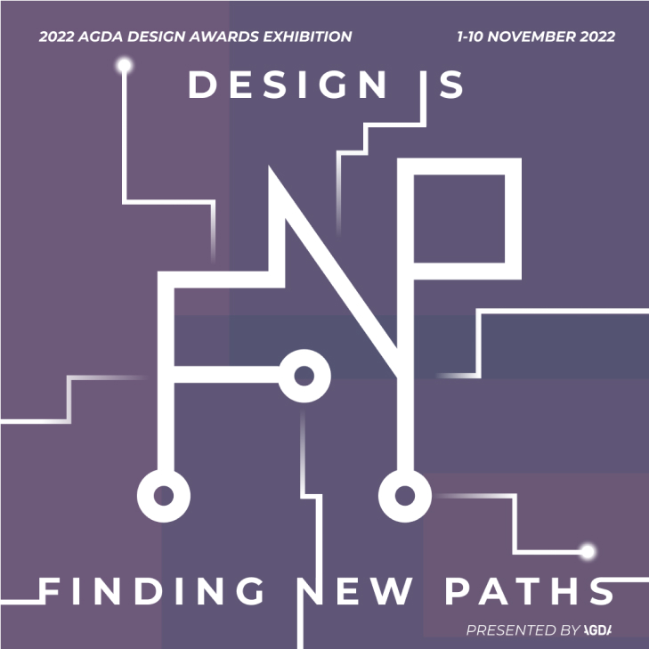
My concept ‘Design is Finding New Paths’ aims to represent this passage of ideas and creativity as design continues to be explored by designers all over the world. It is visually represented by the visual motif of circuit traces (paths). These are often painted onto circuit boards as a way for electricity to move from once place to another. In this visual identity, the creative spark, the idea, is the electricity that is moving forward. It travels from one design to another, from one iteration to the next, from designer to designer. The logo is uses lines and circles to mimic circuit paths forming the letters ‘F’, ‘N’, and ‘P’. In some visual assets, additional circuit paths extrude from the logo and the text, implying that the exhibition it represents can also inspire more design work in the future.
A dark purple is used to accompany the technological and futuristic visuals. Purple, black, and white make up the primary colour palette. Combined, they communicate a serious and structured tone. This is to encourage visitors to approach the exhibit with meaningful intentions, to look for deep understanding as opposed to only aesthetic appreciation.
Primary Identity
The logo consists of the letters ‘F’, ‘N’, and ‘P’, formed and linked together using circuit paths. The letters stand represent ‘Finding New Paths’.
A sans-serif font was chosen to match the thick, straight lined of the ‘circuit’ trace. The text letters are spaced out at 25% of the font size. This matches the open space of the logo design itself. The weight of the text should not be thicker than the lines of the logo.
The logo must be placed between the text ‘Design is’ and ‘finding new paths’.
Secondary Identities
Alternatively, the logo can be used without the text for vertical formats.
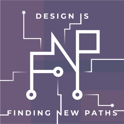
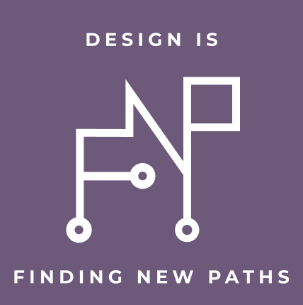
If the colours are reversed (i.e., on a dark background) then the logo and text should be white, and the background should be a dark purple.
Additional decorations can be used, but only as overlapping, coloured rectangles in the background, or as thinner circuit paths extruding from the logo and the letters outwards.
When there are no decorations, the text should be center aligned to the logo.


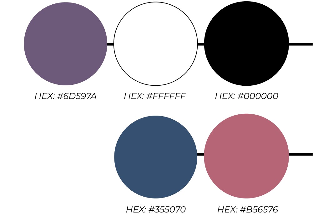
Colour Palette
The primary colour palette for this exhibition is purple, white, and black.
The dark purple hue gives the identity a serious and dignified tone and should be used for visual elements such as graphics and backgrounds.
Additional blue and red is used as secondary colours and are to be used in companion with the purple.
The black and white should be used for text elements, for light and dark backgrounds respectively. This is so that text can be easy to read.
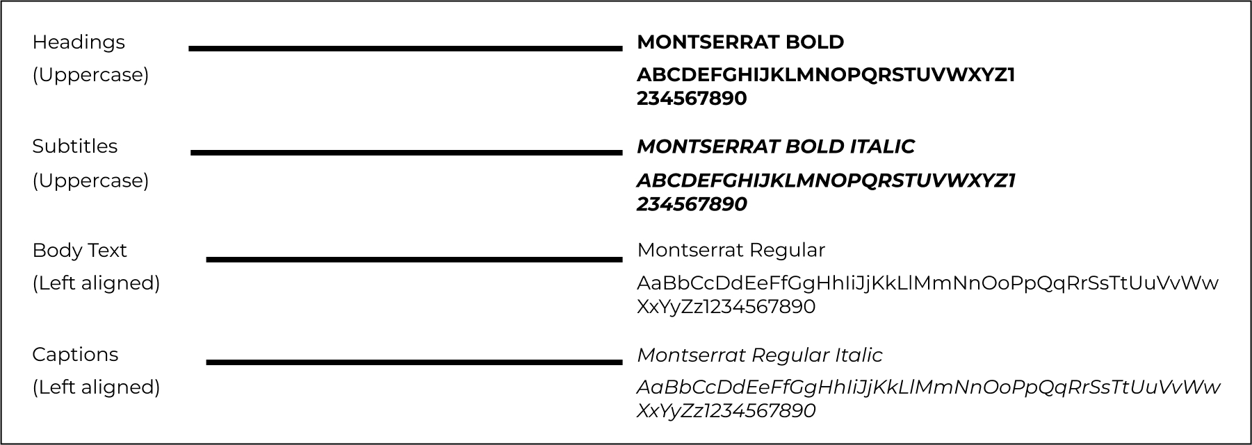
Typography
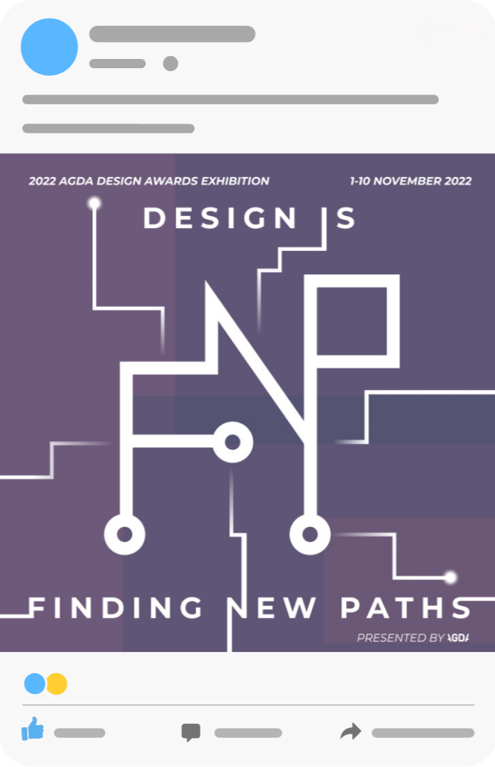
Social Media Promotional Post
Promotional material such as an Instagram post should be uploaded before the exhibition starts and for the duration of the exhibition itself.
It primarily features the exhibition logo and title. The purple was used for the background, a stronger use of colour should help it stand out on someone’s feed
The post description should repeat the exhibition details for the viewer to read.

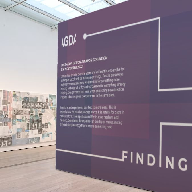
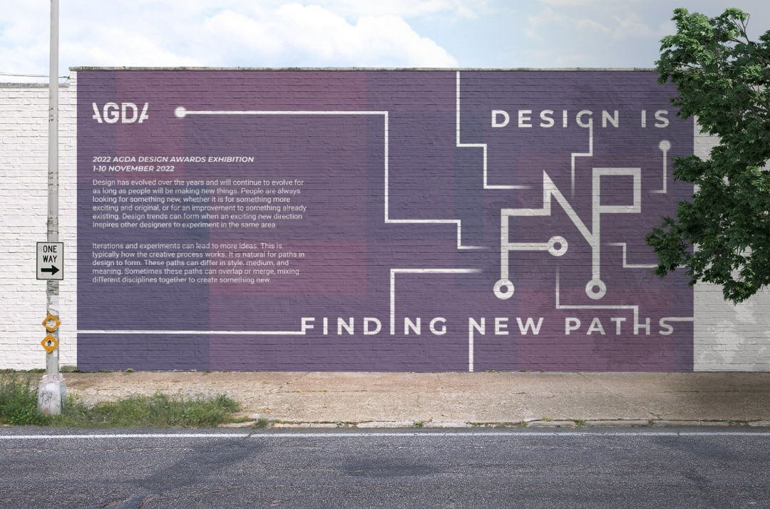
Entry Wall
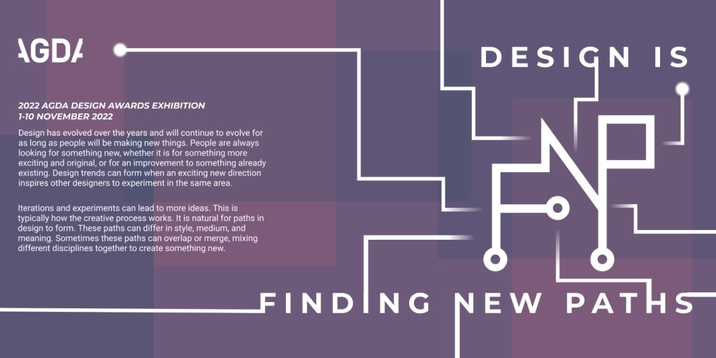
The assignment also required a design for an entry wall to the exhibition event.
The 6000mm wide and 3000mm high wall space outside the exhibition entry will ideally be to the right of the doorway. The visual identity will take up the entire wall space. The logo on the right should be large enough to also act as a background for visitors wanting to take photographs.
On the left is AGDA’s official description and logo. It explains what the organisation and exhibition is about. The lines on image are intended to direct the visitor from the logo to the exhibition entry on the left.
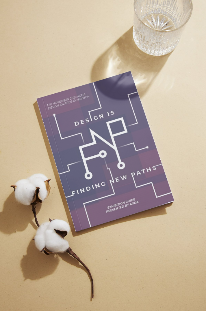
Exhibition Guide
Visitors can pick up an exhibition guide at the entry. It serves as both an introduction and explanation to the exhibition and its featured artists, but also as a souvenir.
It is A5 sized and made with recycled paper. The date is included on the top left corner.
Like the other assets, the logo is in white and used on top of a dark purple background. Circuit paths extrude from the logo and title text and to the edge of the cover, hopefully leading the viewer to turn the page and open the guide.


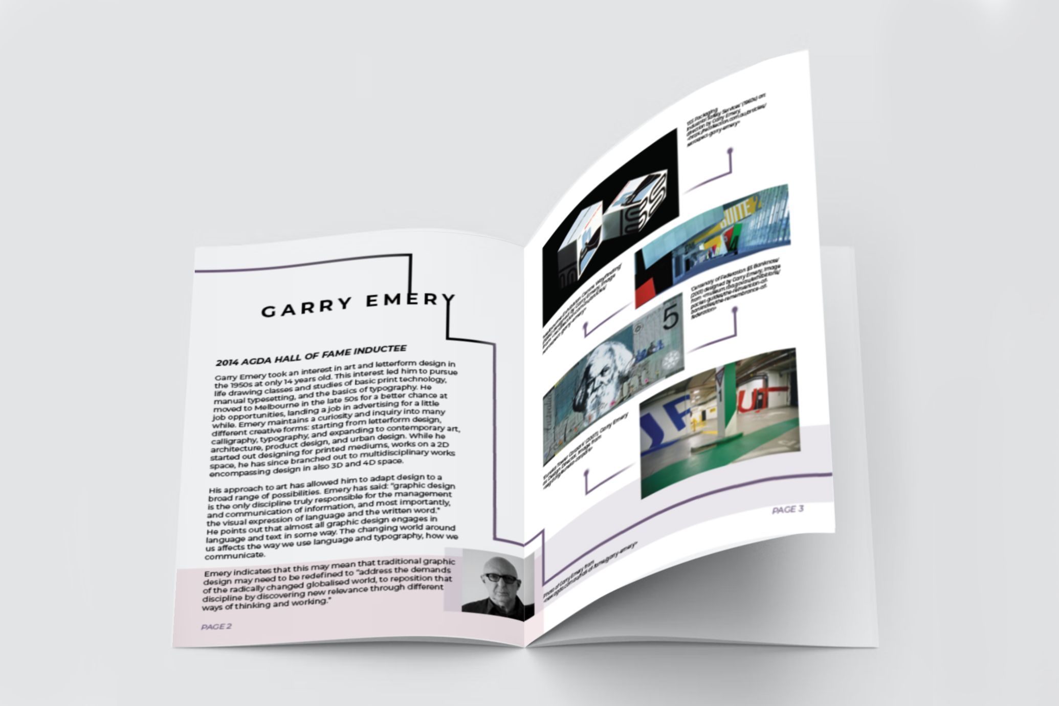
The guide introduces featured creators. Creators from the AGDA Hall of Fame receive a double page spread.
Garry Emery was selected as a featured designer. His work as an individual and as part of his studio ‘emerystudio’ have expanded from exploring letterforms to designing for a diverse range of mediums, incorporating different multidisciplinary practices.
This demonstrates the growing opportunities for design to be considered, the many different paths that design can find itself moving in.

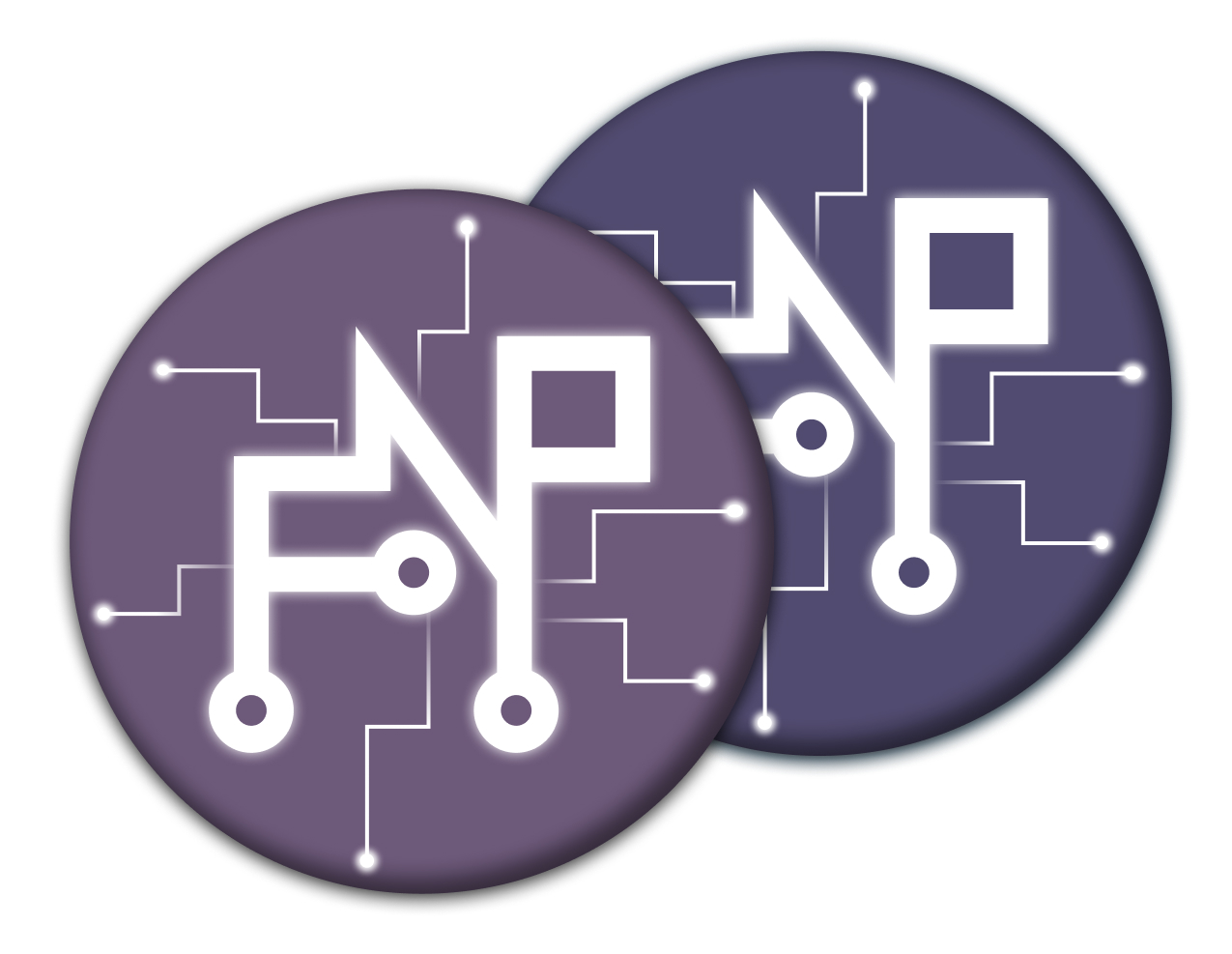
Exhibition Badges
Exhibition visitors can receive a small exhibition badge as a souvenir. It can be pinned to fabric material such as shirts, jackets, hats, and bags.
It features the exhibition logo on a circular badge made of lightweight recycled plastic with a safety pin on the back.