To reconstruct a Moodle platform as an impactful tool for students and staff.
My Role: UI/UX Designer
Team Members: Mustafa, Serena, Sonia, Christian
Tools: Figma, Maze
Skills: User Research, User Personas, User Testing, Wireframing, Prototyping
Background
This team challenge was run by Prodigi (formerly called DigiHub) for their Product Design Program in 2021 as a way to help students learn about and gain experience with product design.
Students were arranged into teams of four, as well as assigned a member of Prodigi to act as a supervisor throughout the program and a mentor who was a working professional in the field. Our team was lucky to have a mentor who was working as a product designer at Canva at the time.
Weekly student-led workshops on different aspects of the product design process would be run every week until the end of the program.
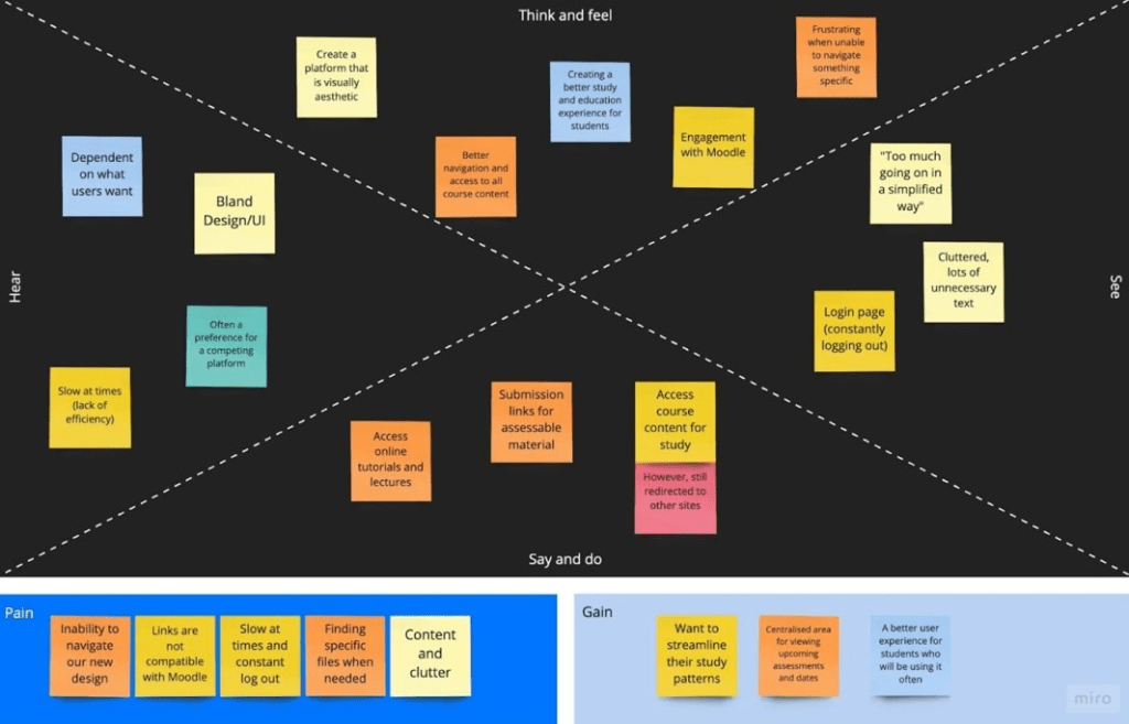
User Research & Analysis
Userbase Survey Results
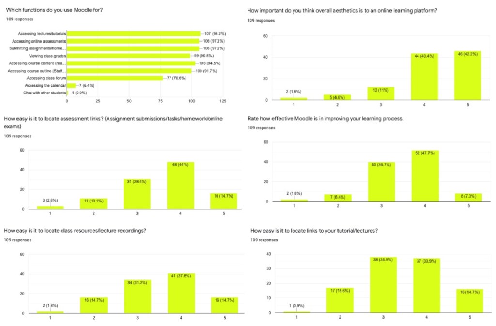
Our team compiled a survey of questions to share with UNSW staff and students. This helped us form an understanding of what the average user may want out of the platform, and of any existing shortcomings we could tackle. The survey received 100+ responses from UNSW students and staff. From these responses, we identified the main issues with the existing platform to be:
- Unused features
- Difficult navigation
- Poor aesthetics
Popular Features
Over 97% of the responses considered the following to be the most used functions:
- Accessing lectures and tutorials
- Accessing online assessments
- Submitting homework and assignments
Moodle has other existing features, but many were left unused by both staff and students.
Navigation
The respondents gave a rating of 3.5/5 average for the ease of locating the information or links that they want or need on the platform.
Aesthetics
Of the responses, 82% considered aesthetics of the user interface to be an important factor to the usability of a learning platform.
Additional Comments
Participants were also asked to provide any additional feedback. Some of these helped inspire us to create new features such as a customisable sidebar, a calendar spread for classes and assessments, and an improved results page for grades.
User Personas
From the survey results, we created user personas to cover what common users may be. These were decided based on the most defining characteristics that impact how a user interacts with the platform.
Below are two examples:
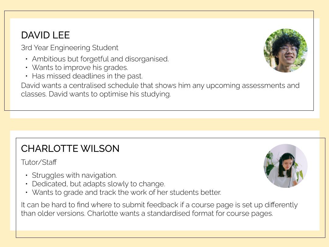
Students like David already lack the incentive to visit Moodle regularly. UniTree strived to redesign the platform to better facilitate effective learning, encouraging students to learn their own way whilst also transforming the way that staff can manage their workload.
Once the user goals had been identified in the personas, these were expanded upon to create a list of requirements that our design intended to fulfill.
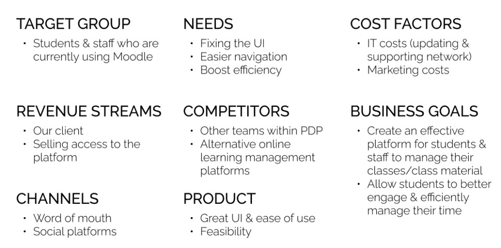
Vision Board
Our vision was to improve the learning experience for current and future students. The redesign aimed to increase engagement and productivity.
Affinity Map
Hierarchy Flow Diagram

Value Proposition
This is how we measured success of our product:
Satisfaction
Increase in satisfaction from both students and staff.
Traffic
Increase in traffic and average time spend on the platform.
Duration
Decrease duration to reach path destinations.
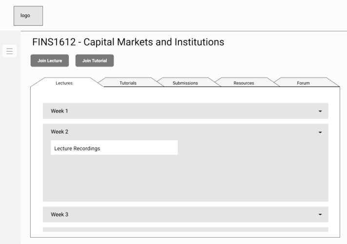
Prototypes
Low-Mid Fidelity Mockups
Low-Mid Fidelity Prototype User Tests
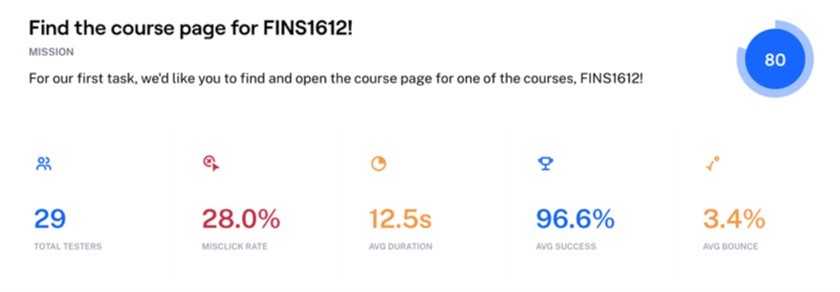
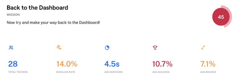
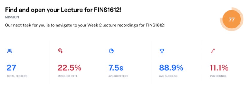
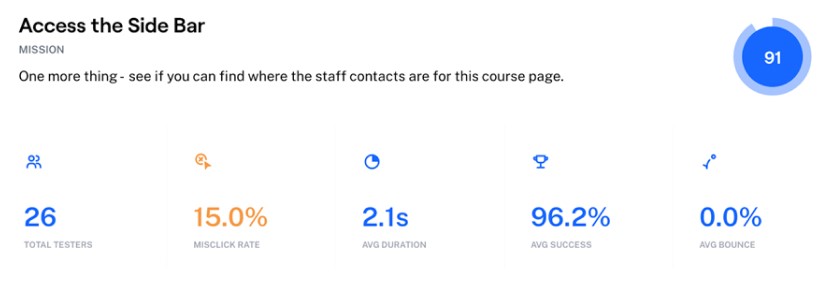
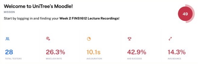
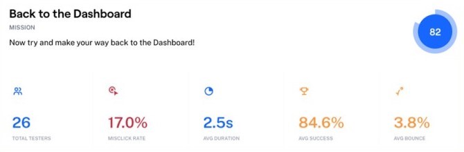
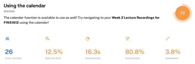
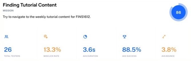
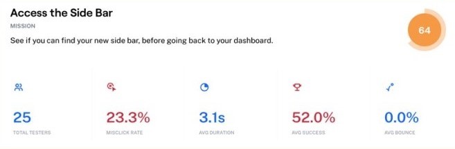
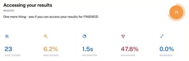
User tests were created and hosted on Maze based on our low-mid fidelity Figma mockups.
Volunteers were asked to complete a series of tasks and Maze would collect details such as mis-click rates, duration, average success rates, and percentage of users who gave up on a task. Test users included students, staff, and non-UNSW students who were unfamiliar with the original platform interface.
High Fidelity Prototypes
Sidebar
Students like David are able to optimise their learning in their own way, with the newly refined sidebar feature. Having our sidebar reduces visual clutter, ultimately creating better navigation and reducing the amount of time to navigate across Moodle.
The customisable features of the sidebar also allow users to have easy access to their most viewed pages, as well as pin any important bookmarks. The freedom to make the sidebar their own allows a return to what is convenient and personalised for each user. This creates more motivation to choose Moodle as a primary platform for managing university work.
The sidebar is available on all pages, which improves efficiency and reduces navigation difficulties for the user.
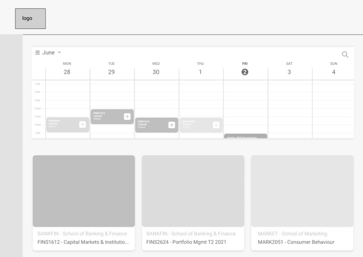
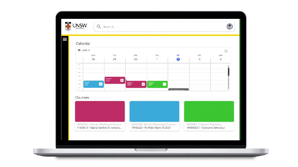
Calendar
The new addition of a larger and more interactive calendar will allow users to optimise their schedules and assessment timelines, all in one place. We aim to help students like David and his frustrations with assessments by showing deadlines on the calendar with additional shortcuts to submission links as well.
Our calendar will be synced to class timetables, which will predominately be from myUNSW, giving direct access to course pages and classes. Users can also link external calendars to the calendar timetable display, providing users the ability to also view their other commitments throughout the week, and plan out their days accordingly.

Grades & Results
Currently viewing or submitting results can involve going to multiple different websites, especially in subjects from different faculties. Sites like Moodle, myUNSW, UNSW Review, or WebCMS are some examples of places students go to get results and feedback. This means that there is not only an issue of different websites for different classes, but also different websites for assessments vs final results.
Our version of the Results page displays assessment results and overall results. A chart on the right provides a visual representation of the student’s progress for a course.
Students can view results for a course by using the year studied and the course code. The assessment title can be clicked on to view any submission details and also for any marker’s feedback from staff members. Being able to access this feedback is important for a student’s ability to identify areas for improvement.
Staff also benefit from being able to mark and post results on the same platform that they receive the student submissions from, which simplifies the whole marking process.
High Fidelity Prototype User Tests
The setup from the low fidelity user tests were reused for the high-fidelity user tests before our final presentation at the end of the program.
A few additional tasks were also included, which were chosen to test if users could intuitively understand what elements to look for and click on our interface. The user would have to interact with each of our main three features at least once during the test.
Our high-fidelity user tests on Maze produced some insightful results. In addition to the tasks, users were also asked at the end of the test to give a rating our of 5 based on their experience. The downside to these remote, self-guided online user tests are that there is a missed opportunity to make behavioural observations or for the user to ask a facilitator any questions during the test. We also included a final feedback question to give our test users the chance to express their opinions to us directly.
Nearly 3/4 of our users found navigating the UI to be a seamless experience, with an average experience rating of 4.7 out of 5.
With increased intuition rates for our calendar and grade features, we have found a 34% increase in UX satisfaction compared to our survey results for the original Moodle platform interface. Our UI was praised for being clean and easy to use.
Other common notes from feedback include users appreciating that courses in the calendar timetable were colour-coded, and that users liked the fact that the results page was easily accessible at all times from the sidebar, especially compared to the pre-existing location of the results and grades page.
Next Steps
If this were to be a real project from a real client, then these would have been our team’s next steps:
- Reiterate
- Fix scrolling issues
- Option to minimise and expand the calendar items
- Easy navigation from results page to dashboard or other specific course pages
- Add
- Improve interactivity with
- More personalised user experience
- Design for mobile use
- Launch
- Creating a design system for consistency in potential future iterations
- Minimise any potential handoff failues to development teams
- Trial launch to a select group of users followed by the final launch
Continuous reiterations and monitoring of results will ensure a smooth and effective execution and launch of product.
Reflection
I found this program to be a valuable follow-up experience to the PantryPal project I had done the year before for my Human-Computer Interaction class. Much of the weekly workshop content reinforced the practices and methods I had learn in that class.
Each team had to build a presentation around their case study and present it to all the other teams, the Prodigi mentors, and a panel of select judges who were all people who had been working in product design. We had rehearsed a number of times beforehand, in order to minimise mishaps happening, especially considering this was all done remotely on a massive Zoom call.
Having a professional as our team member was a highlight of this program experience. Unlike a talk or panel hosted by a society or organisation, the mentorship allowed us to be able to directly ask questions about her experience and the product design field. More than that, our mentor was able to explain to us processes and approaches that she had used in real life and be able to relate it to our project.
I enjoyed the program a lot and had quickly signed up for their follow-up program, the Client Design Program, which would give us the opportunity to work on a real project with the startup FreeGuides.
